Website Information Architecture and Design
|
Measurable outcome: Within weeks of deployment, camper registrations doubled, increasing revenues. Camp administrators received fewer calls for help with registration, reducing costs.
Problem
Huron Forest Camp CedarRidge (HFCC), a non-profit summer camp needed to
|
|
Most importantly, information way-finding and usability needed improvement. As a bonus, they asked for an easy-to-maintain website.
My Role
As UX Designer, I led a user-centered redesign focused on user needs and business objectives in collaboration with camp leadership.
UX Disciplines: Content Strategy, Information Architecture, Information Design, Interaction Design, Interface Design, Visual Design, User Research, Writing for UX.
Deliverables: User Interviews, Personas, Content Audit and Recommendations, Sitemaps, Information Architecture (IA) Usability Testing, and published website.
Approach
I separated the project into two phases, Discovery Research and Design.
Discovery Research
Three user research methods triangulated data to cross verify information. A deep understanding of HFCC objectives and website user goals, motivations, and behaviors emerged.
My Role
As UX Designer, I led a user-centered redesign focused on user needs and business objectives in collaboration with camp leadership.
UX Disciplines: Content Strategy, Information Architecture, Information Design, Interaction Design, Interface Design, Visual Design, User Research, Writing for UX.
Deliverables: User Interviews, Personas, Content Audit and Recommendations, Sitemaps, Information Architecture (IA) Usability Testing, and published website.
Approach
I separated the project into two phases, Discovery Research and Design.
- Discovery Research—Prioritize discovery of HFCC objectives and website user goals, motivations, and behaviors
- Design—Craft a website information architecture and interaction design acceptable to stakeholders and meaningful to users
Discovery Research
Three user research methods triangulated data to cross verify information. A deep understanding of HFCC objectives and website user goals, motivations, and behaviors emerged.
- User interviews with Stakeholders revealed that 'Give' was a top concern and became a navigational element.
- Literature Review showed most camp website visitors need basic information and an opportunity to register.
- Social Media survey of parents of campers validated high priority user tasks and motivations.
- Additional Research: Content Inventory and Analysis of the HFCC website.
- Analytics were unavailable, so I connected the website to Google Analytics.
|
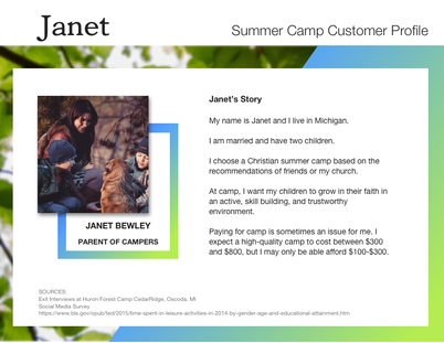
Persona
A primary persona emerged for camp, Janet. Recommendations Analysis of interviews, literature, and survey respondents resulted in the following recommendations for website reorganization based on user tasks by priority. |
|
|
1. Content Strategy
A thorough content inventory was conducted, analyzed, and compared against user needs to craft an effective information architecture for the HFCC website. Three content areas emerged
2. Organizational Scheme The new HFCC website architecture was reorganized around a topical scheme providing a structure for reworked, repurposed, and yet-to-be created content. A topical scheme can expand and contract based on camp offerings over time. The recommended navigation structure included both global and local navigation to facilitate top priority user tasks. |
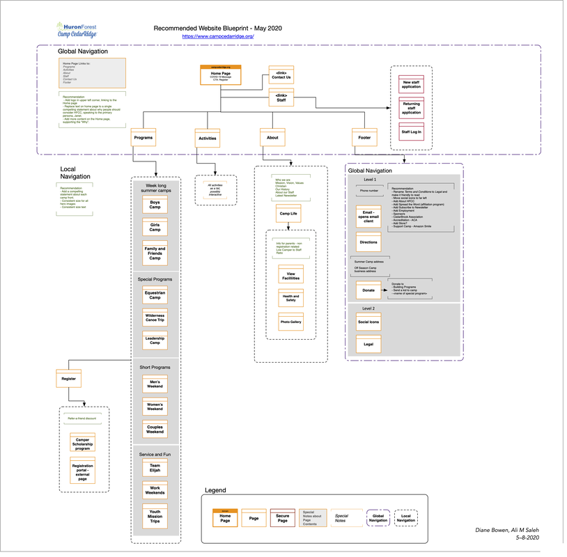
Website blueprint to illustrate the information architecture (IA) and guide interaction design. The IA was Tree Tested with users and refined based on results.
|
The taxonomic structure was tested with users through Tree testing. Based on the findings from the Tree test, adjustments were made to navigation labels and wireframes were tested with users through First Click testing.
Results
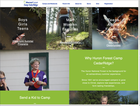
The website reflects the brand promise of HFCC: An extraordinary God-centered summer experience.
- Consistent font styles and brand colors improve credibility
- Photos of real campers and well-placed content identify and communicate the brand promise
- The bottom of every page includes an option to subscribe for news and events - generating leads
- Each page was optimized for SEO by including a page name, title tag, short meta description, and URL slug. Settings allowed search engines to index the page and keywords were added to give search engines info about each page.
- Google Analytics was added to the website to track website performance, discover patterns, and collect visitor insights.
Lessons Learned
The HFCC didn't have a project management tool to communicate questions or sign off on screens. Communications would get lost in emails and key people would be left out of the conversation and the work slowed down.
I introduced Trello as a way to get all eyes on the work, especially the camp director, who had a highly collaborative and relational work style. Trello worked so effectively for this project camp leadership started using it for several other projects.
Measuring improvements against the previous website was not possible since the previous website didn't have an integrated analytics tool. I added Google Analytics to the new website, sharing performance insights and user engagement over time with the leadership team. It has been helpful for leadership to understand the type of user who visits the site, the devices they use, at what time in the year, popular topics, and most visited camp pages.